Embed for Joss Stone – Tell Me
India Arie – Walk With You
Corrine Bailey Rae – I’d Do It All Again
With these videos, we can see a predictable ending, I can relate this to the Todorov’s equilibrium, the theory of predictable narratives. Todorov proposed a basic structure for all narratives. He stated that films begin with an equilibrium, a calm period. Then agents of disruption cause disequilibrium, a period of unsettlement and disquiet. This is then followed by a renewed state of peace and harmony for the protagonists and a new equilibrium brings the chaos to an end. This theory highlights my narrative and other well known soul music videos narratives. From the audience feedback I received they didn’t expect more, they weren’t looking for a complicated narrative, just something simple which kept them gripped.
In terms of performance I kept the same style, singing in natural settings (outside, in her house) I did have plans to make her perform on a large stage. But decided not to do this because I knew that it would be bordering on glamorising the music video, and almost emphasising her status which was not what I wanted it to be about.
In the videos which I studied, they focused a lot on close-ups and tracking shots, to show the emotions of the artists because the songs were emotional and about how they were feeling. , Genres such as rap would focus on personal possessions, they had more establishing, and long shots to show and emphasis their big house or flashy car. Camera shots and mise en scene were very different varying from genre to genre.
Mise en scene was very important, most soul videos focused on natural lighting, as well as natural settings and props, props which could be familiarised and related to by the audience. They didn’t focus on special effects such and clever editing tricks, they kept it simple and clean. However when I was doing my ancillary’s I kept this in mind and the draft ancillary’s were quiet boring judging from audience feedback.

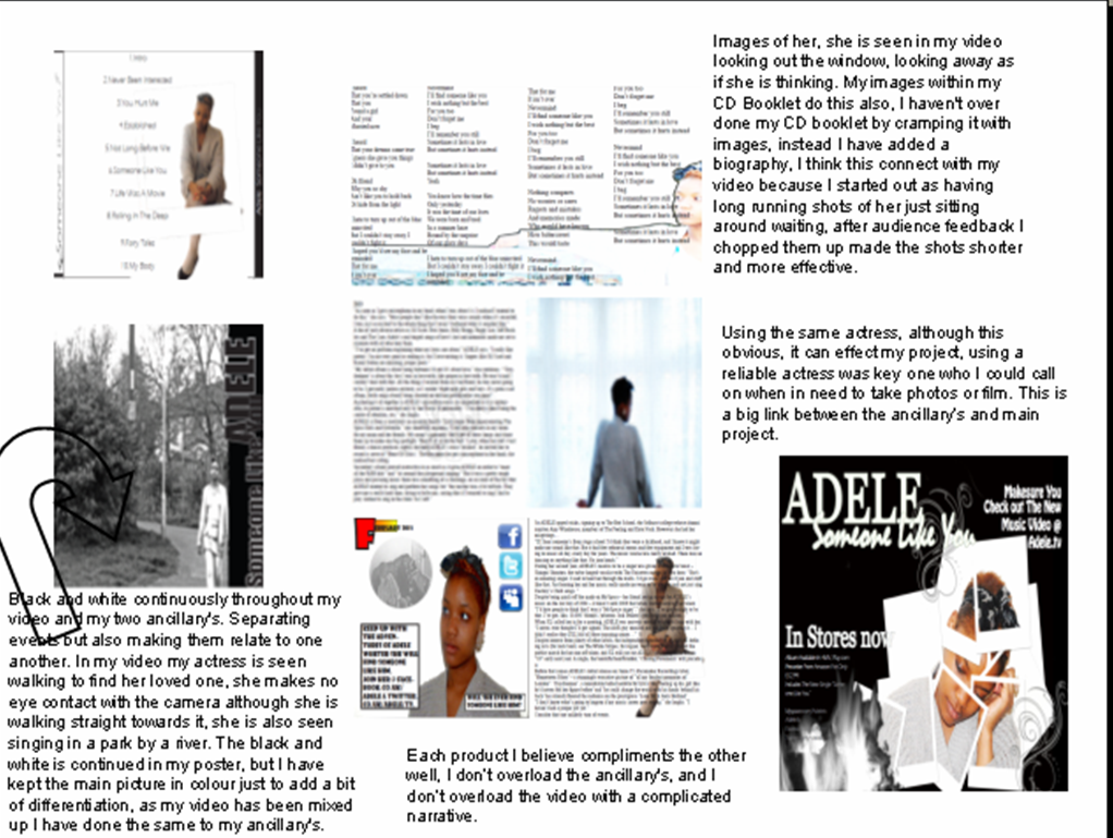
I also focused on the fact that Adele never seemed to look at the camera in her videos posters and CD Covers.


In my poster and CD Cover my model refrains from looking at the camera. This helped when it came to relating my products together also. However like Adele I suggest that by the end of the song the audience and her are now connecting.


This suggests that at the start we don’t know what she is feeling and that by the end we will know what she is feeling and feel more linked with her, it also suggests the audience is taken on a journey through the album as does my music video.
Black and white was a theme I chose to implement after audience feedback which advised me to differentiate in some way, past scenes from present scenes. Adele had used black and white in her posters but not in her video, I believe that black and white enables someone to hide their emotions, it also allows the audience to make their own representations, as it paints a blank canvas. Having two different colours can also suggest a person is sitting on the fence or they haven’t really made up their mind. Black and white posters compared to coloured posters which is better and why. Developing conventions within the neo soul genre wasn’t too difficult however I didn’t want to develop them too much that my products would be unidentifiable within the neo soul genre. In relation to Adele’s target audience I challenged this by using a different actress to widen the audience she already has. Targeting a wider audience has its advantages but also its disadvantages. These are examples of black singer who had white European fans :
I wanted to know if people thought this would affect Adele’s current audience members. I went onto a site called opinionaided were people can leave their questions and choose people to answer them. 80% said they couldn’t care less what the actress looks like, as long as the video is interesting, and not over the top taking away from the actual singing.
In terms of challenging real media products, I think I have added a lot more obvious drama scenes, in Adeles video she often uses images or dances to connote a situation, I have kept it simple and used a straight forward narrative, which tells a straight forward story. In her previous video ‘Rolling in The Deep’, there is no acting which goes with the lyrics, just a dancer drama and smashing plates. I also haven’t showed a lot of singing as they usually does, especially singing within a scene whilst the singer is acting in her video.
Having a comic book page, I did this to emphasis the idea of following the story, this is also emphasised through my tracking shots in my video, and the continuous feel of what is going to happen next. Adding the comic book page, I don’t believe has been done before because in doing my research I didn’t see anything like this however each artist had their own unique page, I didn’t want to do a page with loads of pictures because it was common and boring in my audiences eyes. It also made it more likely for people to follow her adding an element of fun, even though it is a serious emotional album. Pages which ask the audience to follow them on Twitter and Facebook.
To sum up I have used and challenged conventions of real media products within the soul genre to create products which still appeal and are recognisable to my target audience.
After studying a combination of real media products with each other, I came to the conclusion that mine relate quiet well together. My main video and CD cover bode well with mise en scene and camera shots. When looking at my video and my CD booklet
Overall my combination of products are good my audience enjoy them all, they have their preferences but they say that they are all more effective when put together. Each product is understood more when the other products are shown.
I believe my products work well as a combination together, because they share the same elements they don’t look randomly put together. When researching other media products I noted what was done well and proceeded to put it into my products. results from my questionnaire i took into pie charts in order to upload them onto my blog but also to look back at easily when making my video.


'I like the storyboard it seems interesting on paper but i dont think you have used a wide veroety of shots this would mae the film more interesting and makes a huge difference to certain scenes, for example when she is crying or angry a close up becomes more emotional than a long shot'
Even though I had made this the final storyboard, I knew that the main project wouldnt be an exact replica as things would change on the way. My final video recieed good audience feedback.
Having a focus group was very helpful, I choose 4 people from my target audience and had them look at and talk about my ancillary projects. They didnt want to be filmed but they were happy to leave their comments. Having a focus group really helped me re-think my draft ancillarys. I also put up my drafts on facebook, they recieved little comments which told me I needed to do more work on them. After I had completed the final ancillarys I put them up on facebook also, I recieved alot more comments, which made me more confident in the quality of my ancillary projets.
My draft ancillarys were obviously not as good as they could be I didnt get as muich good feedback as I had hoped, whenever I asked how they could be imporved people always had something to say.

After taking into account all my feedback I changed my ancillary's completly, and was pleased with the new results.


I was pleased with the feedback I got in general everyone loved the music video, and thought it complimented the song very well. I sorted out any problems which they brought up, people wished I had mostly finished the song completly, as they thought it was too short, but that is something which I cant do as its required to be only 3 minutes.
'Really like the flashbacks bu they could be more identifiable'
'If you want the buringing picture to be the most iconic opart of your video, it needs to be some how differentiated andmake it stand out becuase it came as a suprise to me on first viewing'
All my feedback was generally the same no one had any big negative things to say about it, no one highlighted any weak areas which I hadnt already noticed or which I couldnt adjust quickly.
I used new media technologies to the best I could, i used facebook to youtube, even looking at behind the scenes music videos, to see how they were planned and made.

Youtube was my main source of research I used it to look at Adele's previos videos, soul videos and backstage photo including interviews.
I found this new video maker on youtube where you can make your own videos and upload tem, I thought this would be a great idea to make my storyboard from, so I started to do this, I managed to create some of it this took me an hour to do:
After doing this I realised it was not worth it to do the whole storyboard in this way as it took up way too much time and wasnt very effective, however watching this over gave me great ideas for camera angles. The shots used in this video were choose by youtube, and I used them in my video.
I also used youtube to upload my Iphone footage, as I didnt know what they looked like on a computer, which is where I would do the editing. Youtube allowed me to plan ahead effectively if I wasnt going to be at college for a long period of time etc. It was just a place for me to research but also a place for me to upload my work, and learn how to use Photoshop even more, although I had learnt alot in AS there was alot of professionals who posted up videos of what I can do with Photoshop, the effects I can create and play around with.
Youtube saved me a lot of time and allowed me to access the necasary information, it is a vital media platform to use when doing a music video as it is where most music videos are first seen because of its huge audience number. It is a cheap and easy way to generate sales, as it is free to upload your video.


When looking up Adele's audience I used twitter and facebook a lot so I could randomly go onto peoples profiles and research their characteristics. using facebook I was able to get quick feedback by uploading my work onto my profile and asking for suggestions and feedback.


Other people did the same so I was also able to use facebook in order to see other people's work. This helped me generate ideas. When om facebook and twitter artists would often advertise their new videos and singles without having to pay for advertisement, just simply writiing it on their wall would be enough advertisement and they wouldnt be wasting money by targeting the wrong audience as all the people following their profile woul be their target audience.

Helping me to find tutorials, I had so many idea's whcih I wanted to do and just didnt know how to get started.


My audience icluded students, and where better to search for feedback than in a student room, the site has over 500,000 members who talk about educational topics, I tried to find previous media students conversations, to gether tips.
All in all my media project has come together very well, because of my hard work, I have stumbled and made mistakes, this is normal I have used all the help which has been provided from my audience feedback to media technologies including my Iphone. My 3 projects work well together I know this because I have had good audience feedback and i havent got tired of watching and looking at my projects over and over and over again. I have thought about everything from product sales, to making sure the video represents the artist style as much as possible. I have managed to develop my work but still keeping it identifiable as a soul music video, which is targeted to a wider audience. When you put my work next to professional work you can see little difference it doesnt look poor quality and it doesnt lok rushed. Because of my high quality research and planning I have managed to make a media project which stands out, but fits into the soul genre, and the music video's wichich have already been published.


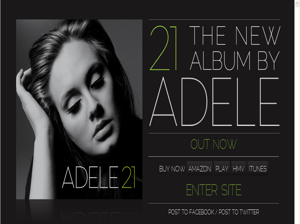
 The Album covers and the single covers keep similar elements, the font, and positioning of writing, all the singles from 19 have her name, and then the name of the single underneath. She wears minimal make - up in all her CD Covers, and she always wears black,


